Gallery Walls
How to Build an Aspen Fall Gallery Wall with Repetition and Rhythm
Learn how to choose between a five-print Aspen fall collection and a single stand-of-aspens photograph, then use repetition, scale, cropping, and arrangement to create a thoughtful gallery wall with Photo Prints.
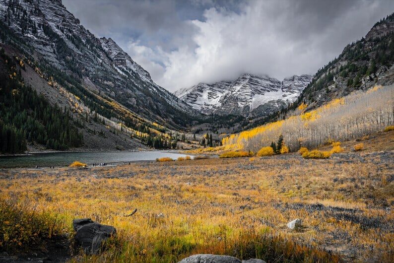
Artwork: BLJ Media original photography · Explore this Photo Print ↗
A gallery wall becomes more convincing when its images share a visual reason for being together. The five-print “Aspen in Fall” collection offers that reason through repeated attention to autumn in Aspen, Colorado, while its selective color against black-and-white creates a clear relationship among the photographs. A single image, such as “Aspens in Aspen,” works differently: it can give a room one focused subject rather than a sequence. Understanding that difference will help you choose whether your wall needs rhythm, emphasis, or a quieter sense of completion.
Start with the wall’s visual job
Before choosing a print, decide what you want the wall to do. A five-image arrangement can guide the eye across a larger area, especially when the photographs are displayed as a deliberate group. The shared subject of autumn in Aspen, Colorado gives the collection continuity, while the selective color against black-and-white offers a built-in point of contrast. This makes the set a natural starting place for a wall that should feel connected rather than assembled at random.
A single-tree or single-scene approach is more restrained. “Aspens in Aspen” presents a photograph of a stand of aspens in Aspen, Colorado, so it can serve as one visual anchor above a console, in a reading corner, or on a wall where surrounding objects already provide enough activity. These are styling suggestions, not rules: the important decision is whether you want one image to hold attention or several related images to create movement.
Why repetition creates rhythm
Repetition is useful because it gives a gallery wall a visual pulse. In the five-print collection, the repeated connection to Aspen’s autumn landscape can make the arrangement feel intentional even when each photograph is considered separately. The selective-color and black-and-white treatment also gives you a recurring visual language to carry from one print to the next, helping the group read as a collection rather than five unrelated nature images.
Rhythm does not require every print to be placed in a perfectly rigid row. You might begin with a symmetrical five-print arrangement if the wall needs structure, or test a vertical stack when the available space is narrow. Another option is a centered grouping with consistent gaps. In each case, keep the relationship between the prints easy to read; excessive spacing can make a set lose its sense of belonging together, while overly tight spacing can make the individual photographs harder to appreciate.
Use scale and cropping with care
Scale should respond to the wall, not simply to the number of images you own. The “Aspen in Fall” set originally used five 11×14-inch Photo Prints, a proportion that can support a substantial grouped display while keeping each photograph individually legible. If you are planning around that original format, measure the total footprint of the arrangement, including the gaps between prints, before deciding where its center should sit.
The single “Aspens in Aspen” listing originally offered multiple sizes and custom sizes by request. That flexibility can make it a practical choice when a particular wall calls for one larger statement or a more modest image. Consider the shape of the available space and the furniture below it, then choose a size that leaves the photograph breathing room. If you are comparing the single image with the five-print set, remember that cropping and scale change the wall’s emphasis: one larger presence feels focused, while several smaller units create a sequence.
Choose color as a connecting tool
Color decisions can determine whether a gallery wall feels calm or visually scattered. Because the five-print collection combines selective color with black-and-white, it already provides a controlled contrast that can help organize a room’s surrounding tones. You do not need to match every nearby object precisely. Instead, consider whether the wall will benefit from that selective-color treatment as a recurring accent or whether a simpler single photograph would sit more quietly within the space.
For a practical example, imagine a wall that already contains several decorative objects and needs one clear focal point. “Aspens in Aspen” may be the more measured choice because it is one photograph of a stand of aspens rather than a five-part display. On a relatively open wall, the five-print collection can offer more visual cadence. The distinction is less about which product is universally better and more about how much visual information the room can comfortably hold.
Plan the arrangement before hanging
Lay out paper placeholders or use removable tape to mark the intended footprint before putting anything on the wall. This simple step helps you test whether a five-print group feels balanced with nearby doors, furniture, or architectural edges. It also lets you compare a horizontal line, a compact block, and a vertical arrangement without committing to one layout. Keep the grouping cohesive, and avoid allowing one print to drift so far away that it reads as a separate idea.
For the single “Aspens in Aspen” Photo Print, test the image alone first rather than automatically adding companion pieces. A lone photograph may be the strongest solution when the wall has an uncomplicated composition already, while the five-print set can be more effective when the room needs a repeated motif. If you combine the single print with other art, treat it as a distinct subject and give it enough space to remain readable rather than making it compete with the five-image collection.
Bring the idea into your space
The best Aspen fall gallery wall begins with a clear choice between sequence and emphasis. Select “Aspen in Fall — Photo Prints (Set of 5)” when you want repetition, a shared autumn subject, and the visual rhythm of five related photographs. Choose “Aspens in Aspen — Photo Prints” when one photograph of a stand of aspens better suits the wall’s scale or the room’s existing activity. Measure first, test the arrangement, and let the available space determine whether your final display should move across the wall or settle into one considered focal point.
Sources and artwork references
This guide draws on the identified BLJ Media product descriptions and photographs below. Styling suggestions are editorial guidance, not claims of product testing or a guarantee of particular results.
Editorial note: This guide was created with AI assistance using BLJ Media’s catalog and passed automated editorial checks. It was published without individual human approval.